Illustrative Redesign: From Blood and Ash

An illustrative book redesign that re-imagines a modern fantasy classic. The series uses moody, symbolic imagery and high-end typography to create a sophisticated collector’s aesthetic that matches the story’s darker themes.
The Story
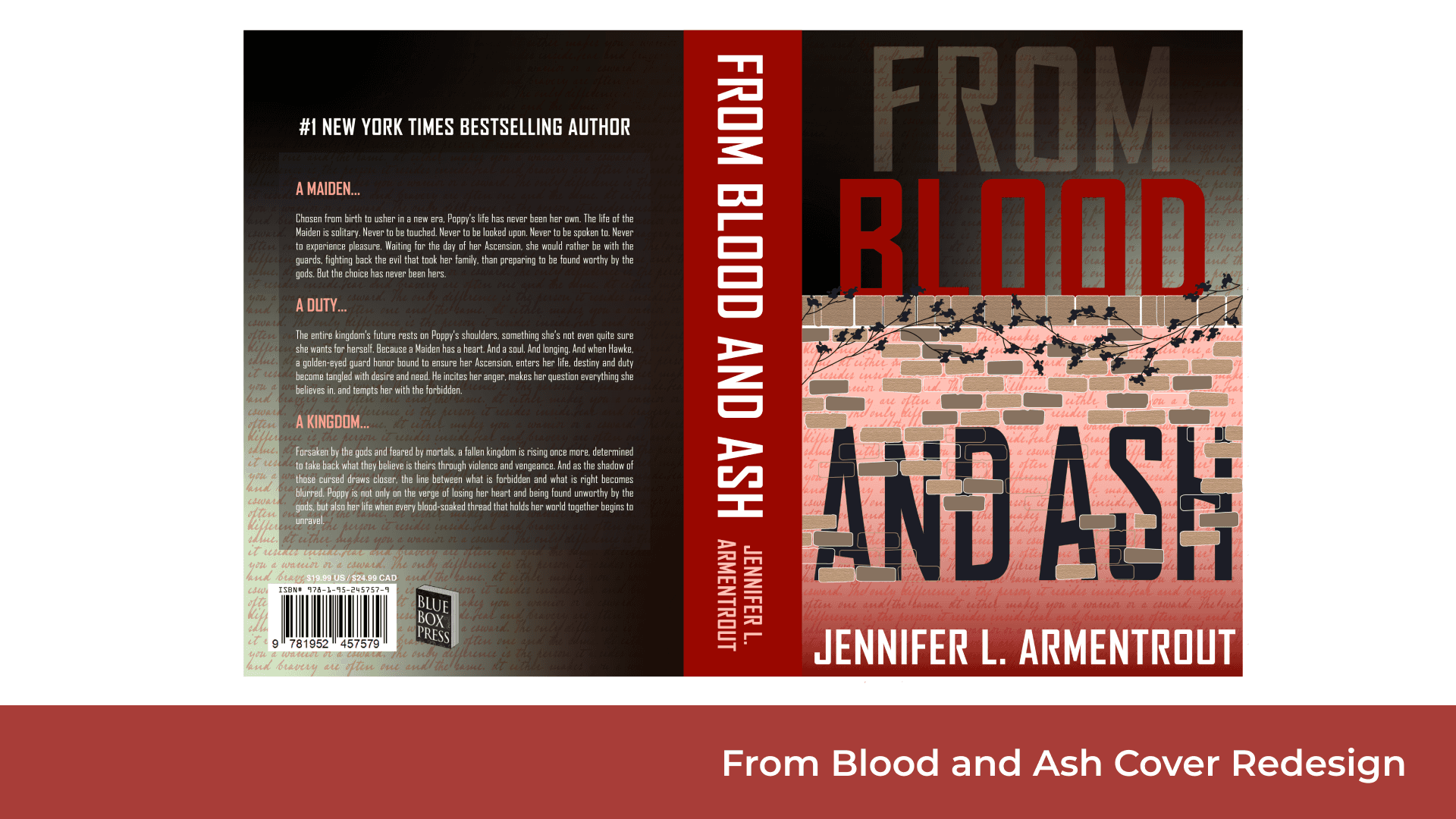
From Blood and Ash by Jennifer L. Armentrout is a cornerstone of modern fantasy romance, but it often finds itself packaged in designs that don't quite capture the deeper, darker tone of the series. This project was an illustrative redesign aimed at shifting the visual narrative. I wanted to move away from the traditional, airy romance covers and instead lean into the series' darker themes, the internal conflict of the protagonist, and the high-stakes world of the Ascended. My goal was to create a cover that feels like a collector’s piece, one that speaks directly to the reader who values the gothic, moody atmosphere of the story.
Challenges
The visual foundation of this design was built on contrast. I looked to mirror the duality of Poppy’s journey, using a mix of light and dark aesthetics that reflect her life as the Maiden versus her true destiny. By utilizing deep, saturated blacks and charcoal tones against sharp, brilliant highlights, I created a visual hierarchy that guides the eye toward the most critical narrative symbols. I wanted the cover to feel tactile and immersive, ensuring that the illustration itself functioned as a window into the intensity of the world rather than just a decorative asset.
Design Decisions
A major part of this design process was choosing the right illustrative metaphors to represent the lore. I moved away from literal character depictions to focus on symbolic imagery, such as poppies, weaponry, and the iconic veil. These elements allowed me to communicate the stakes of the story in a way that feels sophisticated and mysterious. I also made a conscious choice to use highly ornate, custom typography that bridges the gap between classic gothic styles and modern, clean-cut serifs. This choice gives the title a sense of weight and importance on the shelf while maintaining that polished, contemporary look that is so essential to current book design.
The Final LOOK
The finished product is a series of illustrative book covers that function as a cohesive set. By focusing on consistent color themes and unified compositional rules, the redesign feels like a high-end, limited-edition collection. Beyond the primary cover art, I developed a full suite of interior typography and decorative page flourishes that pull the reader deeper into the story experience. This project was a labor of love that allowed me to marry my personal passion for fantasy literature with my professional design standards, creating a series that feels both authentic to the genre and uniquely my own.


More Case Studies


The Heart Behind The Portfolio
I’m Cassidy Torraville, a graphic designer specializing in branding, packaging, print, and game UI. But if you strip away the software and the file formats, I’m a storyteller. I approach design with a simple belief: visuals should do more than just look good—they should make you feel something. Inspired by immersive environments and rich, unexpected aesthetics, I build work that is purposeful, engaging, and built to last.
My toolkit centers around Adobe Illustrator, Photoshop, and Figma, which I use to transform raw concepts into living identities. I sharpened my craft studying Graphic Design at Fanshawe College and collaborating with industry professionals through the RGD Mentorship Program. Those spaces taught me how to think strategically, defend my design choices, and thrive in fast-moving, collaborative environments.
I leave a piece of myself in everything I create. That personal investment is what allows me to connect deeply with my work and, in turn, helps my designs connect authentically with audiences. I’m always looking for new creative challenges, unexpected collaborations, and opportunities to grow.
Let’s build something memorable.
