Raise a Can. Lower Your Impact.

A full brand identity and packaging system that marries craft-focused quality with a clean, modern aesthetic. The design highlights the company’s commitment to process and shelf-presence in a competitive market.
The Story
Salt Water Brewing Company is a craft brewery based on Canada's East Coast that operates under a unique social enterprise model. The core design challenge here was to balance a dual narrative. On one hand, the packaging needed to evoke an authentic, salt-of-the-earth coastal atmosphere that felt honest and local. On the other, it had to clearly communicate a serious corporate partnership with Myriad Canada to promote ocean conservation and plastic reduction. Balancing that sense of place with a mission-driven message was the real heart of this project.
The Foundation
I took a very intentional approach to the visual identity by bypassing the bright, hyper-saturated blues that are so common in beverage marketing. Instead, I opted for a muted, desaturated palette of seafoam greens, deep ocean blues, and weathered, salt-worn greys. This choice immediately established a sense of authenticity and environmental awareness that feels grounded in the actual landscape of the East Coast.

Design Decisions
My typography choice was driven by a need for balance, so I combined rugged, industrial block fonts with slightly rounded, eroded edges. This gave the brand the structural stability required for a beverage label while matching the organic, tide-worn theme of the maritime environment. I also made the decision to move away from treating the beer cans as isolated panels. By designing a continuous, wraparound composition, I turned the aluminum surface into a unified coastal landscape. I then carefully integrated the crucial social responsibility data regarding the plastic-reduction partnership into the mandatory regulatory grid on the back panel, ensuring the important information was accessible without disrupting the overall aesthetic.
The Final Look
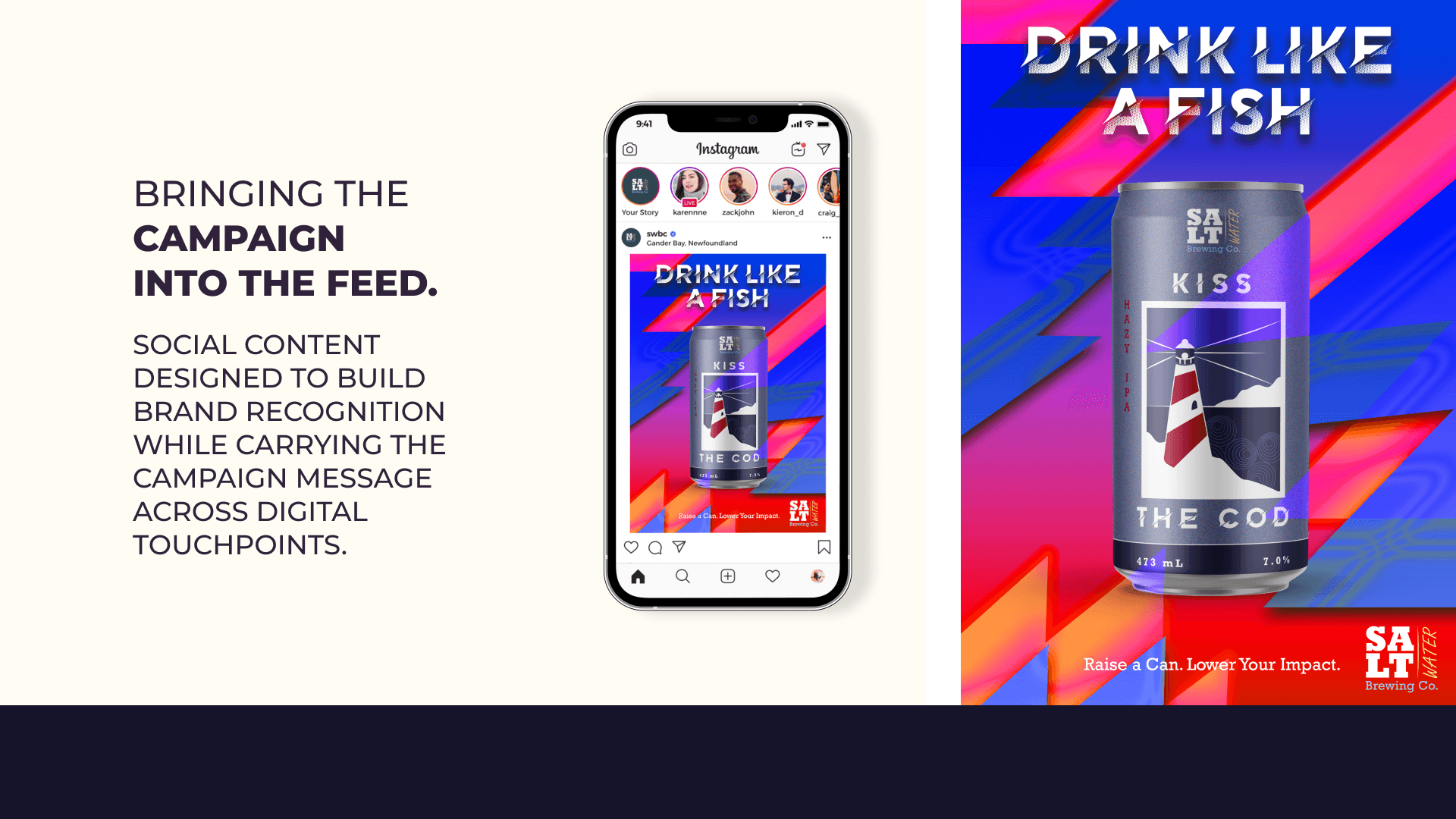
The project resulted in a purpose-driven, comprehensive brand ecosystem that spans aluminum packaging, point-of-sale print collateral, apparel, and digital marketing layouts. I adapted the identity into a full brand style guide, physical table talkers for retail spaces, and a clean, responsive digital grid for social media. Moving from structural packaging dielines in Illustrator to creating realistic material mockups in Photoshop allowed me to see how the brand lives across various physical and digital touchpoints, ensuring that the final execution feels as professional as it does authentic.


More Case Studies


The Heart Behind The Portfolio
I’m Cassidy Torraville, a graphic designer specializing in branding, packaging, print, and game UI. But if you strip away the software and the file formats, I’m a storyteller. I approach design with a simple belief: visuals should do more than just look good—they should make you feel something. Inspired by immersive environments and rich, unexpected aesthetics, I build work that is purposeful, engaging, and built to last.
My toolkit centers around Adobe Illustrator, Photoshop, and Figma, which I use to transform raw concepts into living identities. I sharpened my craft studying Graphic Design at Fanshawe College and collaborating with industry professionals through the RGD Mentorship Program. Those spaces taught me how to think strategically, defend my design choices, and thrive in fast-moving, collaborative environments.
I leave a piece of myself in everything I create. That personal investment is what allows me to connect deeply with my work and, in turn, helps my designs connect authentically with audiences. I’m always looking for new creative challenges, unexpected collaborations, and opportunities to grow.
Let’s build something memorable.
